Studio Ayo
Back to Works
Concept / Pre-launch03 / 12
Case Study · Ountodun Concept Store

Ountodun

Building the identity and digital storefront for a Nigerian concept store

Ountodun began with very little: a name, a Shopify account, and an idea. The concept was to create a curated store for African and Nigerian-made products, bringing together pieces across fashion, accessories and other lifestyle categories. At the time, there were no products, established brand identity, or defined visual system. I was brought in to redesign the Shopify experience, but the absence of an identity quickly made it clear that the project needed to start further upstream. I developed the visual identity alongside the ecommerce experience, creating a system that could give Ountodun a recognizable personality while remaining flexible enough to work across different products and categories. The resulting direction was chic, curated, organic, earthy, subtly Afro-inspired, and quietly luxurious.

Project Details

2025
Client / OrgOuntodun Concept Store
RoleBrand Designer · UI/UX Designer · Art Director
PlatformShopify
StatusConcept / Pre-launch
Scope
Visual IdentityArt DirectionShopify Design
Deliverables
LogoTypographyColour SystemBrand GuidelinesMockupsSocial TemplatesProduct Photography DirectionShopify StorefrontProduct & Collection PagesMobile DesignNewsletter Popup
Creative Team
Brand Designer, UI/UX & Art DirectionStudio Ayo
Bespoke IllustrationsAlex for Studio Ayo
Ountodun
Project Narrative

The Story Behind the Work.

01

The Starting Point

Ountodun’s initial setup was essentially a blank canvas. The business had a name, a Shopify account, and a concept for a curated store — but no finalized products, no existing visual identity, and no established design system.

The initial budget was ₦80,000, and I was also involved beyond pure design, helping develop ideas and supporting parts of the communication around the project.

This created a slightly unusual design challenge. Rather than receiving a complete brief with established products, photography and brand guidelines, I had to help shape the visual direction from the information available.
02

The Challenge

The core challenge was not simply making a Shopify store look better. It was defining what Ountodun should look and feel like before the business had enough physical material to define itself.

The store needed to feel:

• Curated rather than crowded

• Feminine without becoming overly delicate

• African without relying on obvious visual clichés

• Premium without feeling inaccessible

• Organic and warm rather than overly polished

• Flexible enough to accommodate different products

At the same time, the identity needed to work beyond the website, eventually extending into social media, product presentation and photography.

03
Four Core Pillars

Research & Direction

I researched a broad range of concept stores and African-focused brands to understand how different businesses approached curation, cultural references, product presentation and contemporary luxury. Brands such as ALÁRA Lagos, This Is Us, and Good NG became part of the reference landscape, alongside other concept stores and independent brands.

The goal wasn’t to reproduce any particular reference. Instead, I looked for the common principles behind them: How can a store feel distinctly African without becoming visually predictable? How can multiple products live within one visual world? How can warmth and cultural character coexist with a contemporary ecommerce experience?

From that research, I developed a direction around four ideas:

•Chic — A refined visual language with enough restraint to allow the products to remain the focus.
•Curated — The brand should feel intentionally assembled rather than mass-market.
•Organic — Muted, earthy colours and softer visual relationships gave the identity a natural quality.
•Subtle Afro — African influence was treated as an underlying cultural character rather than a collection of obvious motifs.
04

Visual Identity

With no existing identity to work from, I developed the core visual system for Ountodun:

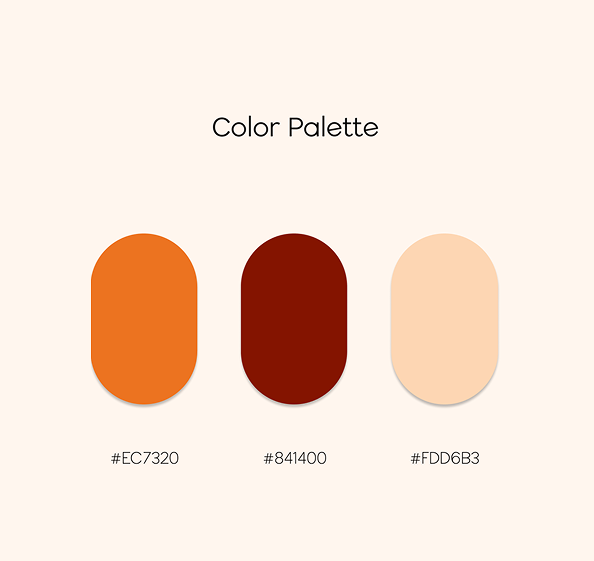
• Colour: The palette moved toward muted, warm and earthy tones, creating a flexible foundation that could sit comfortably alongside different products and photography. Rather than relying on highly saturated colours, the system was designed to feel calm and tactile.

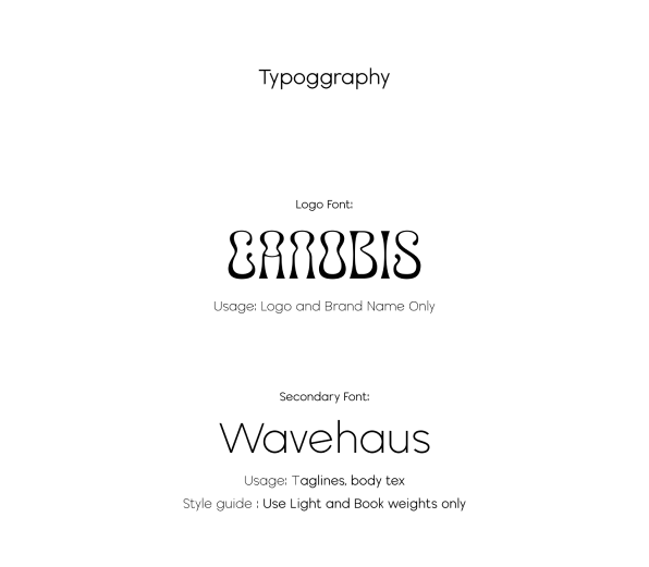
• Typography: Typography was selected to balance the refined and approachable qualities of the concept (CANOBIS for the brand logo mark and Wavehaus for body/subheaders), establishing distinct character while remaining highly usable across ecommerce interfaces.

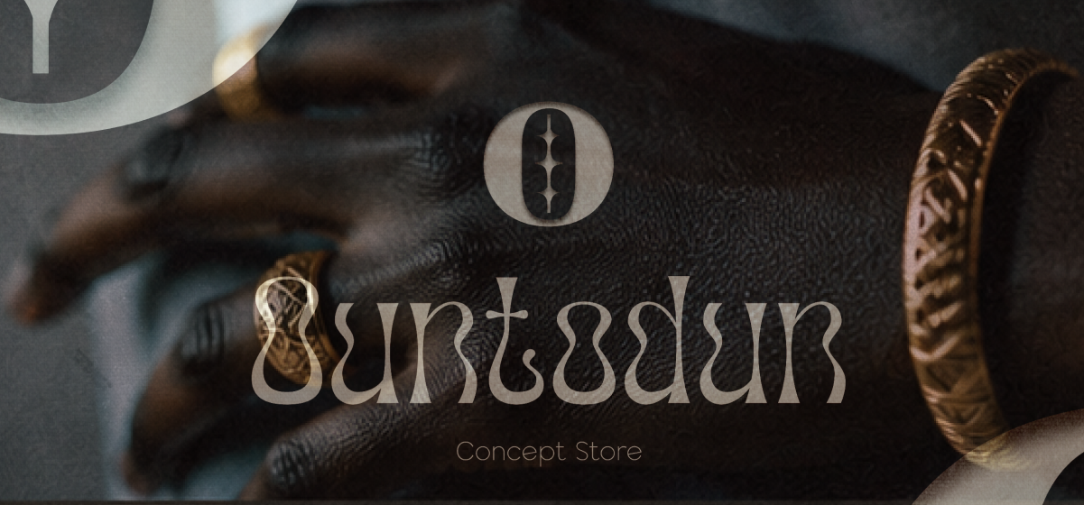
• Logo: The logo was designed as the primary visual identifier within a broader system rather than an isolated mark, remaining recognizable across Shopify navigation, social media, and physical brand touchpoints.

05

Building the Brand Beyond the Logo

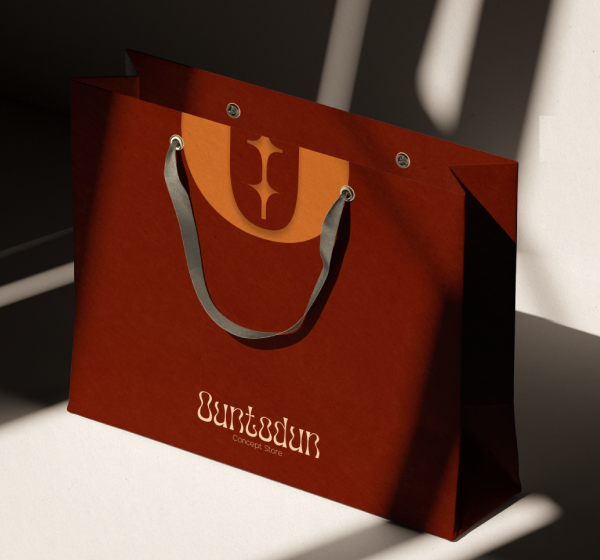
A major part of the project was making sure the identity could actually function as a brand. I developed supporting applications including brand guidelines, social media templates, brand mockups, product presentation direction, and photography direction.

The photography direction was particularly important because the eventual store would depend heavily on product imagery. Rather than treating photography as an afterthought, I considered how lighting, composition, backgrounds and framing could contribute to the overall brand language.

The objective was to make the products and the environment around them feel like part of the same curated world.

06

Translating the Identity into Shopify

Once the identity had been established, I translated the system into the ecommerce experience. The Shopify store became the first major digital application of the brand, designed to feel more like a curated editorial space than a generic ecommerce template:

• Homepage: Established the brand atmosphere before moving users into the product experience, using visual hierarchy, spacing, and typography to give the brand room to breathe.

• Collection Pages: Designed around curation so browsing feels intentional and organized rather than overwhelming.

• Product Pages: Structured to balance visual presentation with the practical information needed to make a purchase decision.

• Mobile: Translated the visual hierarchy into a narrower viewport while maintaining the brand’s spacious, product-focused approach.

• Newsletter: Designed a custom newsletter popup to make email capture feel like part of the brand experience rather than an intrusive utility.

07

Designing Within Shopify's Constraints

One of the interesting parts of the project was working within an existing ecommerce platform rather than designing an entirely custom storefront. Shopify provides the underlying infrastructure, but the challenge is making a template feel like your brand rather than Shopify’s template.

I worked within those constraints to adapt the storefront’s visual language, including typography, spacing, colour treatment, product presentation, and supporting interactions. This required thinking about both sides of the problem: What should the customer experience? and What can the business realistically maintain?

08

Outcome & Project Status

Ountodun ultimately did not progress into a full commercial launch under the original project timeline. As a result, there are no meaningful sales, conversion or customer metrics to present, and I don’t treat the project as a commercially validated ecommerce success.

Instead, the value of the project is in the design work itself: taking an early-stage concept with almost no established visual infrastructure and developing it into a cohesive identity and ecommerce direction. It became an exercise in designing the world around a business before the business had fully formed.

Execution Matrix

What I Worked On.

A multidisciplinary contribution spanning structural research, design systems, and frontend engineering.

01 / DISCIPLINE

Brand Identity

  • •Logo design
  • •Typography system
  • •Colour palette
  • •Brand guidelines
  • •Social media templates
  • •Brand mockups
02 / DISCIPLINE

Art Direction

  • •Product photography direction
  • •Visual styling principles
  • •Product presentation guidelines
  • •Editorial tone
03 / DISCIPLINE

Shopify E-Commerce

  • •Shopify storefront design
  • •Homepage architecture
  • •Collection/category layouts
  • •Product detail pages
  • •Mobile responsive UI
  • •Custom newsletter popup
Retrospective

What I Learned.

Key product insights, system learnings, and architectural principles distilled from the project.

01

Sometimes the brief is not actually the starting point

When a business is still forming, the designer often has to help define the problem before designing the solution.

02

Brand identity and ecommerce are connected systems

The logo, colours and typography aren’t finished when guidelines are exported. They must survive contact with the real world: product photography, mobile screens, collection grids, and platform constraints.

03

Designing quiet contemporary luxury

African influence was treated as an underlying cultural character and warm tactile elegance rather than visual clichés.

Visual Archive

Selected Visual Assets

Gallery Asset 1
Gallery Asset 2
Gallery Asset 3
Gallery Asset 4
Design System Tokens

Identity Specifications

Terracotta Warm#EC7320
Deep Crimson#841400
Alabaster Silk#FDD6B3
“Studio Ayo elevated our concept store into a global luxury benchmark. The brand identity and Shopify experience captured our heritage with unmatched sophistication.”
— Ountodun Leadership • Founder & Creative Lead
Studio Ayo — Digital Web Design Studio · Lagos