Studio Ayo
Back to Works
Working MVP / Launching Soon04 / 12
Case Study · Personal Product / PWA

Hachi

A shared grocery system for people who live together

Hachi is a personal product experiment built around a simple problem: when people live together, keeping track of what needs to be bought, what has already been bought, and who is responsible for it can become surprisingly messy. The information usually lives in conversations, calls, notes, memory and scattered messages. I wanted to turn that everyday friction into a simple shared experience. So I built Hachi. From the initial idea and research to the user flows, interface design, prototyping and working MVP, I took the product from concept to something people can actually interact with on the web and mobile. Hachi is currently a launching-soon PWA, and this project is an exploration of what happens when product thinking, visual design and development are treated as parts of the same process.

Hachi is a shared grocery experience designed to make the everyday coordination of household shopping simpler, clearer and more collaborative.

Project Details

2026
Client / OrgPersonal Product / PWA
RoleProduct Designer · UI/UX Designer · Visual Designer · Developer · Creative Lead
PlatformPersonal Product / PWA
StatusWorking MVP / Launching Soon
Creative Team
Product Design, UI/UX, Dev & Creative LeadStudio Ayo
Visual DirectionLanre
Hachi
Project Narrative

The Story Behind the Work.

01

The Idea

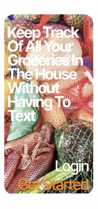
Household grocery shopping sounds simple — until several people are involved. Someone notices that something is finished. Someone else says they’ll buy it. Another person goes shopping and forgets something. A message gets buried. Someone buys an item that was already purchased.

The problem isn’t necessarily the shopping itself. It is the coordination around the shopping.

I became interested in that small gap between knowing what a household needs and actually coordinating that information between people. That became the starting point for Hachi.

02

The Problem

Existing ways of coordinating household groceries often rely on tools that weren’t specifically designed for the problem:

• Messaging apps are good for conversations, but grocery information can quickly disappear inside a conversation.

• Notes are useful for individuals, but they don’t naturally create a shared household state.

• Memory works until it doesn’t.

The underlying problem I wanted to address was: How might a household maintain one shared understanding of what needs to be bought without turning grocery management into another chore?

That question shaped the product. Rather than designing a complicated household-management platform, I wanted Hachi to focus on one thing and make that thing feel effortless.

03
Designing the Household State

Starting with the Experience

I began by thinking through the situations surrounding grocery shopping: Who notices that something is missing? Who adds it? Who is going shopping? What happens when someone buys it? How does everyone else know? What happens when plans change?

These questions helped me move away from designing screens and toward designing the state of the household. The product wasn’t simply a checklist. It needed to communicate a constantly changing shared state.

That became an important principle throughout the design: Hachi should make the current state obvious.

04
The Central Loop

From Idea to Product Structure

I mapped the basic journey before thinking about visual styling. The goal was to reduce the number of decisions someone has to make when adding or checking an item.

I explored the core interactions around: Adding → Tracking → Updating → Completing.

The resulting experience needed to accommodate both the person adding groceries and the people who would later see, update or complete them. This helped establish the foundation for the MVP. Instead of filling the product with features, I focused on making the central loop understandable.

05

UX Design

I moved from the product structure into flows and wireframes. At this stage, I deliberately stripped away visual decoration. The questions were more basic:

• Can someone understand what the product is for?

• Can they find the information they need quickly?

• Is it obvious what needs attention?

• Can an item be added without unnecessary friction?

• Can the shared state change without confusion?

• Does the interface communicate what happened after an action?

The wireframes became a way of testing the logic of Hachi before investing heavily in its visual language.

06

Designing the Interface

Once the core experience was established, I began developing Hachi’s visual identity and interface. I wanted the product to feel approachable without becoming childish, and distinctive without allowing visual personality to interfere with usability.

The interface became a balance between four core principles:

• Clarity — Information needs to be understood quickly.

• Personality — Hachi should feel like a product with character rather than another generic productivity tool.

• Structure — Shared information needs clear hierarchy.

• Feedback — Actions need to communicate what has changed.

The visual system grew directly from the product’s functional requirements.

07

Designing for Shared Information

One of the more interesting design problems was that Hachi isn’t purely an individual productivity tool. Its information belongs to a group. That changes how the interface needs to communicate.

An item isn’t simply: "I added this." It becomes: "This is something our household currently needs."

That distinction influenced how I thought about hierarchy, status and interaction. The interface needs to help people understand not just what they did, but what the household currently knows. This became one of the central ideas behind the product.

08

The Visual Layer & Art Direction

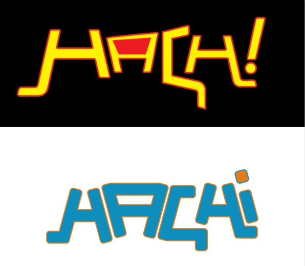
Although Hachi is a product-design project, I didn’t want the visual language to feel disconnected from my broader design practice. I approached the product as both a functional interface and a visual system, exploring graphic composition, typography, visual hierarchy, illustration, interaction, motion, and art direction.

Lanre supported the visual direction of the project. My role was to connect the visual work back to the product experience — asking: Does it communicate the product? Does it belong to the same visual language? Where can the product afford to be expressive, and where should it remain functional and quiet?

This is where multidisciplinary practice becomes useful: design and engineering aren’t separate projects, but parts of the same product.

09
Design and Development as One Loop

Building the MVP

The project became particularly valuable to me when I moved beyond the design file. I built the frontend and turned the product into a functioning web/mobile MVP.

That changed the way I evaluated my own design. In Figma, an interaction can look finished. In a working product, everything has consequences: spacing becomes real, responsive behaviour becomes real, states have to exist, and interactions have to actually work.

My process became cyclical: Think → Structure → Design → Build → Test → Adjust. Implementation exposed problems that weren’t always visible in design, turning Hachi from a concept into a working MVP.

10

The Current MVP & Where Hachi Is Going

Hachi is currently available as a working web/mobile experience, with the product being prepared for launch. The MVP represents the first practical version of the idea rather than the final version of Hachi.

The next phase is about learning from real use, identifying where the experience creates genuine value and deciding which parts of the concept deserve to become more developed.

For now, Hachi represents something important: an idea I didn’t leave inside a notebook or Figma file. I took it through the messy middle: researched it, designed it, built it, and turned it into something that exists.

Execution Matrix

What I Worked On.

A multidisciplinary contribution spanning structural research, design systems, and frontend engineering.

01 / DISCIPLINE

Product

  • •Product ideation
  • •Problem definition
  • •Research
  • •Product structure
  • •Feature thinking
02 / DISCIPLINE

UX

  • •User flows
  • •Information architecture
  • •Wireframing
  • •Interaction design
  • •Prototyping
03 / DISCIPLINE

UI

  • •Interface design
  • •Visual hierarchy
  • •Components
  • •Responsive layouts
  • •Interaction states
04 / DISCIPLINE

Visual

  • •Art direction
  • •Graphic design
  • •Visual language
  • •Creative experimentation
05 / DISCIPLINE

Development

  • •Frontend development
  • •Translating interface into working product
  • •Testing experience in-browser
  • •Iterating based on implementation
Retrospective

What I Learned.

Key product insights, system learnings, and architectural principles distilled from the project.

01

Small problems can contain real product opportunities

Grocery shopping isn’t a glamorous problem. That’s exactly why I found it interesting. There are plenty of everyday systems that people have simply learned to tolerate because nobody has bothered to make them significantly better.

02

Designing the system matters more than designing the screen

The interface is only the visible layer. The harder work was figuring out what information exists, how it changes and how different people understand the same shared state.

03

Building changes how I design

Working directly on the MVP made technical constraints part of my design thinking. It forced me to consider how ideas behave outside Figma and in real browsers.

04

Multidisciplinary doesn’t mean doing everything at once

My role is to establish the direction, understand the different disciplines and bring their contributions into one coherent experience. That is where creative direction becomes useful.

Visual Archive

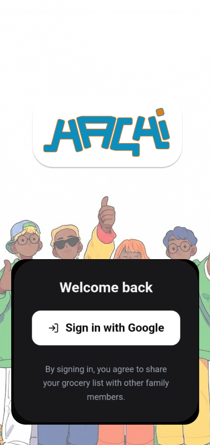
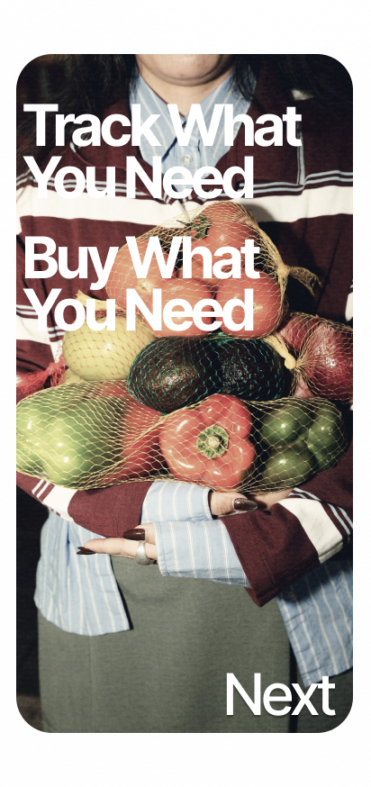
App Interface Flows & Mobile Architecture

App Screen 1
App Screen 2
App Screen 3
App Screen 4
App Screen 5
“Hachi turns everyday household friction into a simple, collaborative shared product experience.”
— Studio Ayo Product Lab • Working MVP / PWA
Studio Ayo — Digital Web Design Studio · Lagos